Blog > The Power of Data Visualisation in Business Analytics
The Power of Data Visualisation in Business Analytics
May 15th, 2023
Table of Contents
To gain valuable insights and make informed decisions, businesses need to be able to effectively analyse and communicate their data findings. This is where the power of Data Visualisation comes in.
Today Data Visualisation has become an indispensable tool for Business Analytics - so much so that it has become a cornerstone in every business analytics training program.
Data Visualisation allows businesses to understand and communicate complex information in a way that is easy to comprehend.
Raw data can be difficult to interpret, especially when there is a large amount of information. By transforming this data into visual representations, such as charts, graphs, and dashboards, business analysts can quickly and effectively communicate important insights and trends to decision-makers.
Visualisation also allows businesses to identify patterns and relationships that might be otherwise difficult to see. When data is presented in a visual format, it becomes easier to spot trends and patterns that may not be immediately apparent from the data itself. This can help businesses identify new opportunities, optimise operations, and make more informed decisions.
There are many Data Visualisation tools available that businesses can use for analytics. Here are some popular ones.
Tableau: Tableau is a powerful Data Visualisation tool that allows businesses to create interactive dashboards, reports, and charts. It is user-friendly and offers a variety of data connectors that make it easy to communicate with different data sources.
Power BI: Power BI is a business analytics service by Microsoft that provides interactive visualisations and business intelligence capabilities with an interface simple enough for end users to create their own reports and dashboards.
Google Data Studio: Google Data Studio is a free data visualisation tool that allows businesses to create interactive dashboards and reports using data from a variety of sources, including Google Analytics, Google Sheets, and Google AdWords.
Domo: Domo is a cloud-based platform that allows businesses to create real-time dashboards and reports, and collaborate with team members in real-time.
SAP Lumira: SAP Lumira is an analytics and data visualisation tool that allows businesses to create interactive dashboards and reports using data from a variety of sources, including SAP HANA and SAP BusinessObjects.
These are just a few examples of data visualisation tools that are suitable for businesses. The choice of tool depends on the specific needs and requirements of the business, as well as the data sources they are using.
Choosing the right visualisation can make the difference between effectively communicating insights or confusing your audience.
The right visualisation can help you convey complex information in a clear and concise manner, allowing your audience to quickly understand and interpret your data.
There are several common types of visualisations used in data visualisation, including:
Bar charts: Bar charts are used to compare different categories of data. They display data as horizontal or vertical bars, with the length of the bar representing the value of the data.
Line charts: Line charts are used to show trends over time. They display data as a series of points connected by a line, with the position of the points representing the value of the data.
Scatter plots: Scatter plots are used to show the relationship between two variables. They display data as a series of points on a graph, with the position of the points representing the values of the two variables.
Pie charts: Pie charts are used to show how a whole is divided into different parts. They display data as a circle divided into slices, with the size of each slice representing the proportion of the data.
Heat maps: Heat maps are used to show the distribution of data values over a two-dimensional area. They display data as a grid of coloured squares, with the colour of each square representing the value of the data.
Tree maps: Tree maps are used to show hierarchical data structures. They display data as a series of nested rectangles, with the size of each rectangle representing the value of the data.
These are just a few examples of common types of visualisations used in data visualisation. The choice of visualisation depends on the type of data being analysed and the insights that need to be communicated.

If the field of Business Analytics excites you and you see your future self excelling in this field, then here are some tips you can follow while choosing a Data Visualisation course.
To choose the right course, you should look for one that covers the following topics:
Understanding different data types: A good course will teach you how to identify the different types of data (e.g., categorical, continuous, etc.) and which visualisations are best suited for each type.
Identifying your goals: The course should cover how to determine what you want to communicate with your data and how to choose a visualisation that effectively communicates that message.
Considering your audience: A course on data visualisation should teach you how to consider your audience's needs and level of data literacy when choosing a visualisation.
Evaluating different visualisations: The course should cover the advantages and disadvantages of different types of visualisations and how to choose the one that best suits your data and goals.
Testing and refining: Finally, a good course will teach you how to test your visualisations with your audience and adjust to improve their clarity and effectiveness.
By choosing a course that covers these topics, you can choose the right business analytics certification program.

Choosing the right business analytics certification program for your business analytics journey requires careful consideration of your career goals, course content, quality of instruction, mode of delivery, and industry recognition. By taking these factors into account, you can choose a course that will help you achieve your career goals and succeed in the field of business analytics.
Kickstart your business analytics journey with the upGrad Campus business analytics training program. With this program, learn how to tackle complex business problems using in-demand tools.
- Why Visualisation Matters in Business Analytics
- Data Visualisation Tools for Smooth Run
- Importance of Right Visualisation
- Picking the Best Program for Your Journey
- Conclusion
To gain valuable insights and make informed decisions, businesses need to be able to effectively analyse and communicate their data findings. This is where the power of Data Visualisation comes in.
Today Data Visualisation has become an indispensable tool for Business Analytics - so much so that it has become a cornerstone in every business analytics training program.
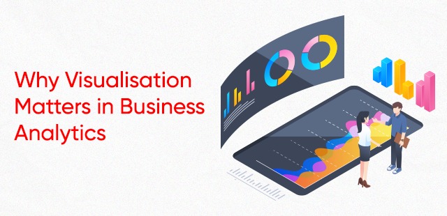
Why Visualisation Matters in Business Analytics
Data Visualisation allows businesses to understand and communicate complex information in a way that is easy to comprehend.
Raw data can be difficult to interpret, especially when there is a large amount of information. By transforming this data into visual representations, such as charts, graphs, and dashboards, business analysts can quickly and effectively communicate important insights and trends to decision-makers.
Visualisation also allows businesses to identify patterns and relationships that might be otherwise difficult to see. When data is presented in a visual format, it becomes easier to spot trends and patterns that may not be immediately apparent from the data itself. This can help businesses identify new opportunities, optimise operations, and make more informed decisions.
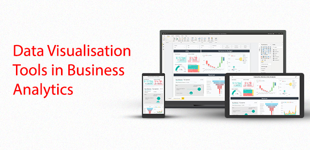
Data Visualisation Tools in Business Analytics
There are many Data Visualisation tools available that businesses can use for analytics. Here are some popular ones.
Tableau: Tableau is a powerful Data Visualisation tool that allows businesses to create interactive dashboards, reports, and charts. It is user-friendly and offers a variety of data connectors that make it easy to communicate with different data sources.
Power BI: Power BI is a business analytics service by Microsoft that provides interactive visualisations and business intelligence capabilities with an interface simple enough for end users to create their own reports and dashboards.
Google Data Studio: Google Data Studio is a free data visualisation tool that allows businesses to create interactive dashboards and reports using data from a variety of sources, including Google Analytics, Google Sheets, and Google AdWords.
Domo: Domo is a cloud-based platform that allows businesses to create real-time dashboards and reports, and collaborate with team members in real-time.
SAP Lumira: SAP Lumira is an analytics and data visualisation tool that allows businesses to create interactive dashboards and reports using data from a variety of sources, including SAP HANA and SAP BusinessObjects.
These are just a few examples of data visualisation tools that are suitable for businesses. The choice of tool depends on the specific needs and requirements of the business, as well as the data sources they are using.
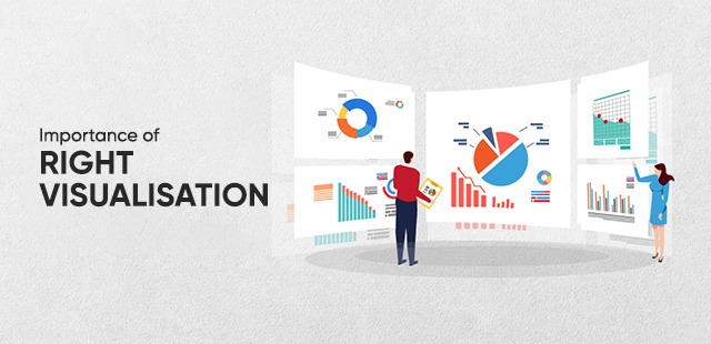
Importance of Right Visualisation
Choosing the right visualisation can make the difference between effectively communicating insights or confusing your audience.
The right visualisation can help you convey complex information in a clear and concise manner, allowing your audience to quickly understand and interpret your data.
There are several common types of visualisations used in data visualisation, including:
Bar charts: Bar charts are used to compare different categories of data. They display data as horizontal or vertical bars, with the length of the bar representing the value of the data.
Line charts: Line charts are used to show trends over time. They display data as a series of points connected by a line, with the position of the points representing the value of the data.
Scatter plots: Scatter plots are used to show the relationship between two variables. They display data as a series of points on a graph, with the position of the points representing the values of the two variables.
Pie charts: Pie charts are used to show how a whole is divided into different parts. They display data as a circle divided into slices, with the size of each slice representing the proportion of the data.
Heat maps: Heat maps are used to show the distribution of data values over a two-dimensional area. They display data as a grid of coloured squares, with the colour of each square representing the value of the data.
Tree maps: Tree maps are used to show hierarchical data structures. They display data as a series of nested rectangles, with the size of each rectangle representing the value of the data.
These are just a few examples of common types of visualisations used in data visualisation. The choice of visualisation depends on the type of data being analysed and the insights that need to be communicated.
Picking The Best Program for Your Journey
If the field of Business Analytics excites you and you see your future self excelling in this field, then here are some tips you can follow while choosing a Data Visualisation course.
To choose the right course, you should look for one that covers the following topics:
Understanding different data types: A good course will teach you how to identify the different types of data (e.g., categorical, continuous, etc.) and which visualisations are best suited for each type.
Identifying your goals: The course should cover how to determine what you want to communicate with your data and how to choose a visualisation that effectively communicates that message.
Considering your audience: A course on data visualisation should teach you how to consider your audience's needs and level of data literacy when choosing a visualisation.
Evaluating different visualisations: The course should cover the advantages and disadvantages of different types of visualisations and how to choose the one that best suits your data and goals.
Testing and refining: Finally, a good course will teach you how to test your visualisations with your audience and adjust to improve their clarity and effectiveness.
By choosing a course that covers these topics, you can choose the right business analytics certification program.
Conclusion
Choosing the right business analytics certification program for your business analytics journey requires careful consideration of your career goals, course content, quality of instruction, mode of delivery, and industry recognition. By taking these factors into account, you can choose a course that will help you achieve your career goals and succeed in the field of business analytics.
Kickstart your business analytics journey with the upGrad Campus business analytics training program. With this program, learn how to tackle complex business problems using in-demand tools.
Related Articles


Add a Comment